I had breakfast with Cate Huston and I told her that I was working on a blog post called “Should you build an app or a website?†She opined that perhaps mobile apps, both native and web, are better because they have constraints. When you have a small screen, you have to have a good UI. You can’t offer users every possibility, you have to make some decisions and choices for them on what they might want to do.
Cate talked about an art teacher who constrains kids to black and white charcoal, then to a drawing started to someone else and then to a drawing torn in half. They are more creative and come up with more inspired work because they have artificial constraints.
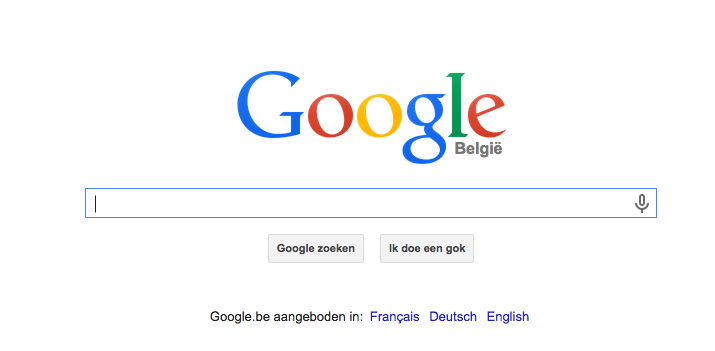
When I think about really single purpose, simple websites, I think about Google’s home page.
There’s a few apps like that too.
What do you think? What would your website look like if you knew that everyone had to look at it through a 640×320 screen and could only interact with it using touch sensitive gloves because it was raining ice chunks outside?